 How To Dig Google Adsense Gold Part 4 of 15 is all about google adsense color palettes. Google Adsense color palettes are like clothes for your ads. And just like fashion models no one will give them a second glance if you don't dress them up to catch eyes. But keep in mind that we are here not to trick the user into clicking your google adsense ads but drawing attention to them and letting them be the judges. As always keep in mind the one to bring you all these articles and more all about google adsense and precharge projectnet.
Getting Down To Business
Google Adsense has a lot of choices when it comes down to color palettes and this makes sense after all they want your google ads to look like they are going to prom everyday. First things to consider are what kind of colors your page has and where the google adsense ads will be located. Second what kind of technique you are going to use to maximize your earnings, currently there are three major color palettes techniques: blend, compliment, or contrast. Third does your website have a lot of static traffic or is it pretty much random. Fourth the fact of all the things you have on your website competing for the user's attention.
Blending In Your Ads
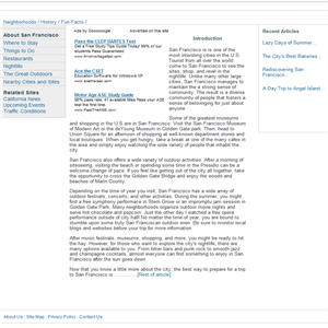
Blending your google adsense ads using color palettes is a major favorite among the google adsense community. Few opt out to the other two methods though they can be as effective as blending depending on what kind of website you are working on. Blending includes making your google adsense ad units the same background as your web page and using the same link color on your google adsense ads as your links on your web page. This is easy since most websites have a white background with blue links the Open Air palette built in with google adsense can be used. Making your text link description the same color as you ads is also highly recommended.
Compliment Google Adsense
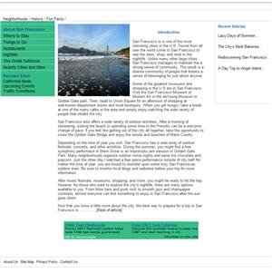
I don't mean complimenting your google adsense quite literally of course but in method. Using your color palettes to make your google adsense ads look like they belong to your website. This is way different from blending as blending makes them disappear, complimenting makes them obvious but part of your overall website design. Check out the example in the image above. The background color should be your secondary color on the website the most reoccurring color next to your background. But the text should be the same as your website. Giving your google AdSense ads a "homely" look.
Contrast Or Reject Your Google Adsense Ads
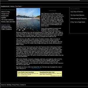
Contrasting your google adsense color palette to your website is a lesser liked method of using google adsense but may be effective as well. You ever see those advertisements on television that just shocks you, that have nothing to do with the product being advertised yet they catch your attention? Well it shocked your took you from the ordinary to something a little out of this world. Contrasting your google adsense ads is sort of the same thing. The goal is to make your google adsense ads as different as possible from your website. I am talking about opposites here. There are obvious colors that contrast each other like black on white, red on blue, or even gray on green. This one is very easy to do since all you have to do is do a crazy color design.
Multiple Google Adsense Color Palettes at the Same Time
No doubt your google adsense needs are different and if you don't want to use google adsense channels to spend hours or even days trying to figure which color palettes work est with your website or even if you did test and let's say two methods both got you equal earnings. Well you can use this new technique from google adsense that allows to use up to four color palettes on one ad unit. Simply go to your google adsense account and under color palettes choose the multiple palettes option and hold down the control or command key to choose multiple palettes.
Proven Colors
Well I can't leave you out to dry without first giving you a couple of suggestion to get you started. First of all google adsense is not the first to start with different color coordination to get catch people's attention. The advertising industry has been at it for a long time. And after a lot of research the colors that seemed to catch user's attention the most were black on red or yellow. For some weird reason we seem to notice those colors the most. Some say this is because at night time is when we must pay most close attention since the limited visibly and red or yellow come from an indication of something dangerous so we seem to pay more attention to them. If your don't believe me ask yourself why traffic signals are the same colors everywhere and why yellow and red means to stop? Not to mention the lights on your car or the colors companies like Winn-Dixie use.
Unique
In all of this keep in mind that no two websites are alike even with the same content the users are always different. So keep on trying different methods until your get it just right.
Thank You
